02 / Mobility identity · Ghana
Trotxi.
A new direction for the everyday commute.
Inspired by Ghana’s trotros and taxis, Trotxi brings affordability and convenience together in one mobility identity.

Move Smart, Live Better.
- My role
- Brand identity & graphic design
- Design tool
- Adobe Illustrator
- Scope
- Naming, logo, livery, campaigns & applications
01 / The name
Two familiar ways to move.
Trotro brings affordability; taxi brings convenience at an extra cost. Trotxi combines their names around a more dependable workday commute.
The identity puts everyday commuters first, especially people on the margins whose travel choices depend on cost and time.
through shared travel
for an extra fare
One shared ambition.

02 / The symbol
A deliberate change of direction.
The arrow bends within the T to express the need for a new direction in public transport. It gives a familiar initial a sense of movement and purpose: a commute shaped more closely around the people who depend on it.
The symbol can stand on its own or introduce the full name. That flexibility carries through the identity, from a compact chest logo to the larger gesture across the side of a shirt, and from a small key strap to a vehicle seen at a distance.
03 / Visual language
One identity. Different expressions.
Green, navy and a near-white mint keep the applications connected.
Typography / Poppins
Move Smart, Live Better.
Poppins in the brand statement; Pangram in the earlier identity studies.A family of apps, one recognisable mark.
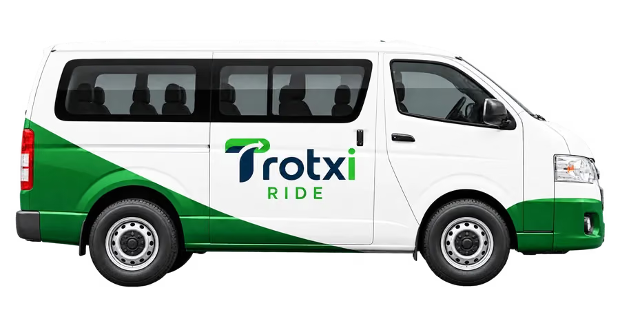
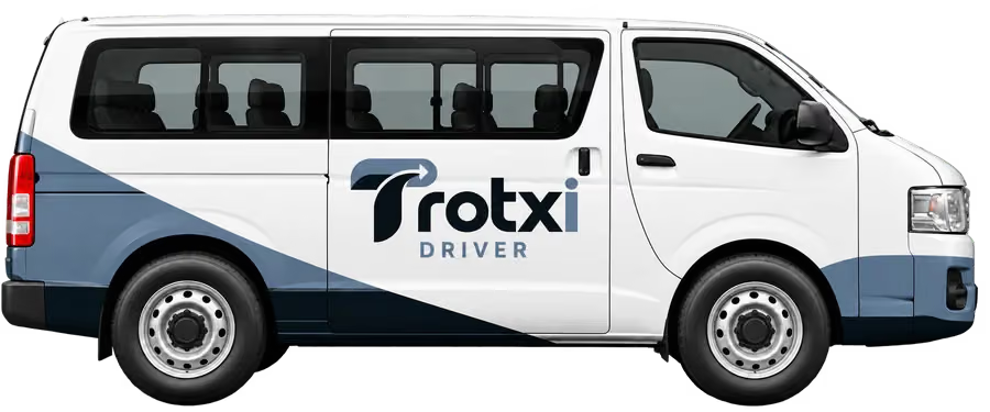
Green identifies the commuter experience, blue the captain’s app, and purple Routekeeper HQ. The full wordmark carries the same identity across the three roles, with light and dark treatments for each.
Commuter
Green / everyday journeys


Captain
Blue / behind the wheel


Routekeeper HQ
Purple / coordinating the service


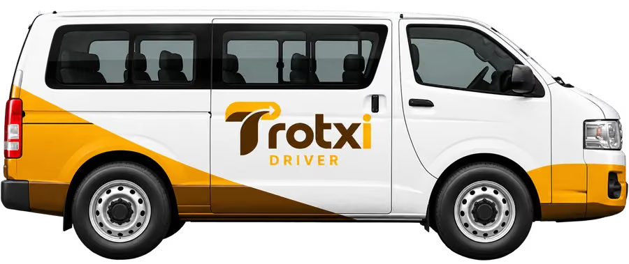
Recognisable in motion.
05 / Identity in use
Worn, carried, recognised.
Two scales of the same mark: a restrained chest logo and an expressive side wrap.
Everyday objects, with a shared identity.
A notebook, travel cup and small keepsakes extend the visual language into the everyday journey. Material, scale and placement give each object its own character.
Product applications are design concepts presented through AI-assisted mockups.
06 / Print & digital campaigns
An invitation to take part.
Everyday commuting challenges, interwoven routes and a journey taking shape become three invitations for commuters to share how they travel.
The fronts introduce the survey; the reverses share pilot and beta details, united by colour, typography and logo.
07 / Pilot & beta form artwork
From an invitation to a shared experience.
The registration illustrations connect the pilot journey with the app people will help test.